SwiftUI Prototype Tutorial 2 of 5: Category Card View

In this installment of our SwiftUI tutorial series, we’ll build out our Category Card View.

Posts in this series:

Here’s the current state of our prototype.
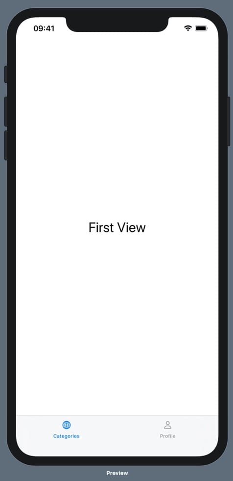
An iPhone 11 Pro max running our prototype. On the prototype is the text "First View" and a bottom tab bar with two options: Categories and Profile. Above the categories tab label is a globe icon, and above the profile tab label is a person icon. The categories tab is blue and the profile tab is black.

By the end of this section, our prototype will look like this.
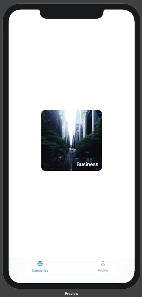
An iPhone 11 Pro max running our prototype. On the prototype is a bottom tab bar with two options: Categories and Profile. Above the categories tab label is a globe icon, and above the profile tab label is a person icon. The categories tab is blue and the profile tab is black. Above the bottom tab bar is an image of a foggy New York City taken from above a road, looking down it. There are deep green trees on either side of the road. The image is positioned in the center of the screen and has a lot of white space around it. Its corners are rounded and it is square. Overlayed on the image in the bottom right is the text "Business" in white. There is more distance between this text and the edges of the image when compared to the previous image.

Categories View

Let’s create the Categories view!

To keep things tidy, we’ll create a new file by left clicking on the folder NewsPrototype (the yellow one) in the Project Navigator (View > Navigators > Show Project Navigator).

Select SwiftUI View and hit next.

Name the file Categories and make sure its Group is NewsPrototype (the one with the yellow folder). Hit Create.

In our new Categories.swift file, you’ll see Xcode has created a Categories view for us. Let’s get our Live Preview working with this view. We still want to see a preview of our ContentView, so we’ll just change line 19 from Categories() to ContentView().

Now let’s hook up our new Categories view to our TabView. In ContentView.swift, change the line Text("First View") to Categories(). You should now see “Hello, World!” in the Live Preview on the Categories tab.

TabView(selection: $selection){
    Categories() // Update
        .tabItem {
            VStack {
                Image(systemName: "globe")
                Text("Categories")
            }
    }
    .tag(0)

Category Card View

Back in Categories.swift, let’s create a new view for our CategoryCard, which we can then render in our Categories view.

To do this, we’ll create a new struct called CategoryCard that subscribes to the View protocol.

struct CategoryCard: View {

}

To learn more about the View protocol, hold Alt and click on it.

All structs that subscribe the View protocol need a var body of type some View. Let’s add this and put a Text view with the string Category Card inside.

struct CategoryCard: View {
    var body: some View {
        Text("Category Card")
    }
}

Now let’s use our new CategoryCard view in our Categories view by replacing Text("Hello, World!") with CategoryCard().

struct Categories: View {
    var body: some View {
        CategoryCard() // Change Text("Hello, World!") to CategoryCard()
    }
}

Great! Now we can work on our Category Card.

Here’s what it will look like at the end of this section.

An iPhone 11 Pro max running our prototype. On the prototype is a bottom tab bar with two options: Categories and Profile. Above the categories tab label is a globe icon, and above the profile tab label is a person icon. The categories tab is blue and the profile tab is black. Above the bottom tab bar, centered on the screen, is an image of a foggy New York City taken from above a road, looking down it. There are deep green trees on either side of the road. The image has rounded corners and, overlayed in the bottom right corner is the text "Business" in white.

First, let’s add this image to our Xcode project. Navigate to the folder Assets.xcassets. Right click in the left sidebar and select New Image Set. Drag and drop the below image onto the 1x, 2x, and 3x drop zones. Then rename the Image Set to business using the Attributes Inspector (View > Inspectors > Show Attributes Inspector).
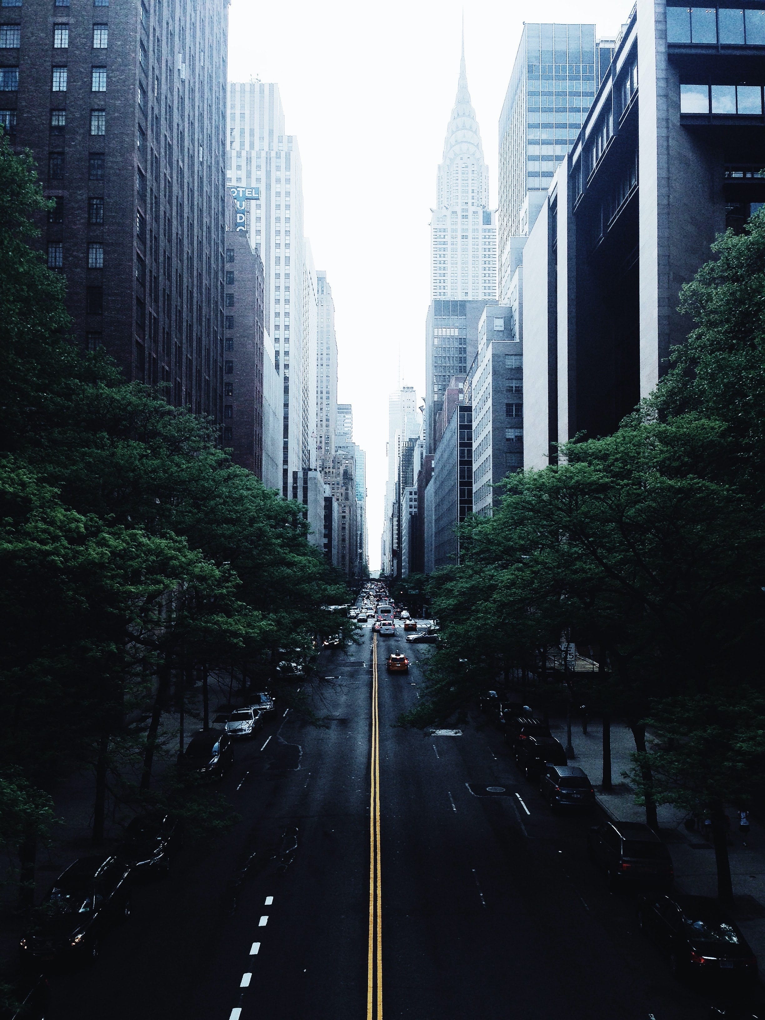
A foggy New York City from above a road, looking down it. There are deep green trees on either side of the road.

While we’re here, let’s also remove the Image Sets first and second.

Back in Categories.swift, we can use our image. First, we’ll create a new ZStack, which enables us to overlay views on top of one another. Then we’ll put our image inside it.

struct CategoryCard: View {
    var body: some View {
        ZStack {
            Image("business")
        }
    }
}
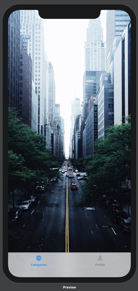
An iPhone 11 Pro max running our prototype. On the prototype is a bottom tab bar with two options: Categories and Profile. Above the categories tab label is a globe icon, and above the profile tab label is a person icon. The categories tab is blue and the profile tab is black. Above the bottom tab bar is an image of a foggy New York City taken from above a road, looking down it. There are deep green trees on either side of the road.

Next, we’ll make our image resizable and shrink it down with the frame method. We’ll also use the aspectRatio() method to ensure the image doesn’t stretch.

ZStack {
    Image("business")
        .resizable()
        .aspectRatio(contentMode: .fill)
        .frame(width: 200, height: 200) 
}
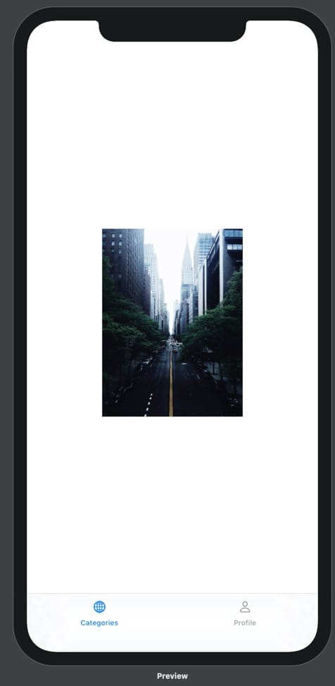
An iPhone 11 Pro max running our prototype. On the prototype is a bottom tab bar with two options: Categories and Profile. Above the categories tab label is a globe icon, and above the profile tab label is a person icon. The categories tab is blue and the profile tab is black. Above the bottom tab bar is an image of a foggy New York City taken from above a road, looking down it. There are deep green trees on either side of the road. The image takes up the rest of the screen.

Now let’s add the category name in a Text view.

ZStack {
            Image("business")
                .resizable()
                .aspectRatio(contentMode: .fill)
                .frame(width: 200, height: 200)
            Text("Business") // Add category name
        }

Our text is now visible, but it’s not styled. We can style our text by writing code manually, or we can use the Attributes Inspector (View > Inspectors > Show Attributes Inspector). Position your cursor on the Text view in your code and change the Color in the Attributes Inspector to White. Then change the Font to Headline. Your preview should update and you will see the relevant methods in your Text view code!

Text("Business")
    .font(.headline)
    .foregroundColor(Color.white)
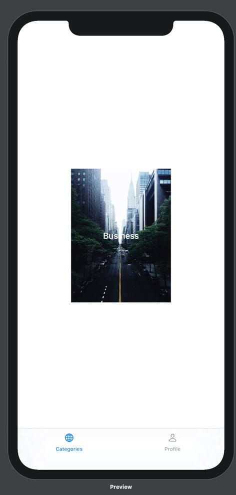
An iPhone 11 Pro max running our prototype. On the prototype is a bottom tab bar with two options: Categories and Profile. Above the categories tab label is a globe icon, and above the profile tab label is a person icon. The categories tab is blue and the profile tab is black. Above the bottom tab bar is an image of a foggy New York City taken from above a road, looking down it. There are deep green trees on either side of the road. The image is positioned in the center of the screen and has a lot of white space around it.

We can control the position of the Text within the ZStack by including the alignment parameter in our ZStack instance. We’ll supply the argument .bottomTrailing, but I encourage you to explore other options. Type . after alignment: to see the alternatives in a completion list.

ZStack(alignment: .bottomTrailing) { // Add alignment parameter
      Image("business")
          .resizable()
          .aspectRatio(contentMode: .fill)
          .frame(width: 200, height: 200)
      Text("Business")
          .font(.headline)
          .foregroundColor(Color.white)
  }
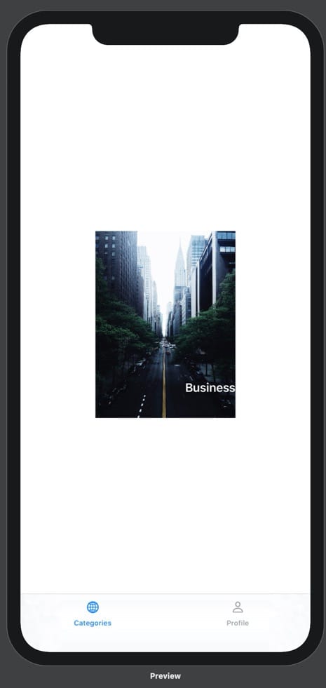
An iPhone 11 Pro max running our prototype. On the prototype is a bottom tab bar with two options: Categories and Profile. Above the categories tab label is a globe icon, and above the profile tab label is a person icon. The categories tab is blue and the profile tab is black. Above the bottom tab bar is an image of a foggy New York City taken from above a road, looking down it. There are deep green trees on either side of the road. The image is positioned in the center of the screen and has a lot of white space around it. Overlayed on the image in the center is the text "Business" in white.

Let’s clip our Category Card down to size and round its corners.

struct CategoryCard: View {
    var body: some View {
        ZStack(alignment: .bottomTrailing) {
            Image("business")
                .resizable()
                .aspectRatio(contentMode: .fill)
        .frame(width: 200, height: 200)
            Text("Business")
                .font(.headline)
                .foregroundColor(Color.white)
                .padding(12)
        }
        .clipShape(RoundedRectangle(cornerRadius: 14, style: .continuous)) // Add clip shape to the whole ZStack
    }
}
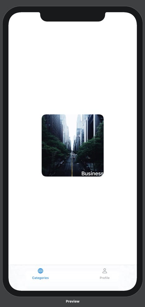
An iPhone 11 Pro max running our prototype. On the prototype is a bottom tab bar with two options: Categories and Profile. Above the categories tab label is a globe icon, and above the profile tab label is a person icon. The categories tab is blue and the profile tab is black. Above the bottom tab bar is an image of a foggy New York City taken from above a road, looking down it. There are deep green trees on either side of the road. The image is positioned in the center of the screen and has a lot of white space around it. Its corners are rounded and it is square. Overlayed on the image in the bottom right is the text "Business" in white.

Getting close! Let’s just add some padding to that text.

Text("Business")
    .font(.headline)
    .foregroundColor(Color.white)
    .padding(12) // Add padding

And that’s it! Our Category Card is looking great.

An iPhone 11 Pro max running our prototype. On the prototype is a bottom tab bar with two options: Categories and Profile. Above the categories tab label is a globe icon, and above the profile tab label is a person icon. The categories tab is blue and the profile tab is black. Above the bottom tab bar is an image of a foggy New York City taken from above a road, looking down it. There are deep green trees on either side of the road. The image is positioned in the center of the screen and has a lot of white space around it. Its corners are rounded and it is square. Overlayed on the image in the bottom right is the text "Business" in white. There is more distance between this text and the edges of the image when compared to the previous image.

Pro-tip: including style: .continuous here gives us Apple’s smooth corner radius style.

See you for Part Three, in which we’ll build our Category View.